The importance of lines
After learning the importance of lines in Telephoto Landscape photography, something obvious occurred to me. From those lines come proportions.
Could it be the proportions which make the lines good or not?
To explore this, it is necessary to explore the concept of proportions in visual art. One student argued that “Photography forces perspective” yet what is equally being forced is the sense of proportion. For example, getting down and close to an object with a super wide angle lens will render the object very large and the background objects will look tiny. In terms of forcing proportions, this technique could make a mouse look much bigger than horses. The opposite example is to use a Telephoto (long) lens and shoot your subject from some distance, this will make the objects in the background look huge. A good example is the classic heron against the setting sun photo.
Tours Around Iceland
Abstract lines
In this next photo, I am looking at the lines: in an abstract image, the lines serve no other function that to show the boundary between the different ice and water surfaces. Despite struggling with the Depth of Field for this particular focal length (I had to use f/32). The eventual choice was this image because I felt each surface had equal proportions. This was an attempt to play with the concept that despite their different appearance, each texture deserved an equal statement in the image.
If the lines serve to make a partition, then the proportions must be important, but when lines serve to lead the eye, then maybe the proportions become important, although I would argue that considerations on the proportions created by lines should always be included – even if the actual proportion never actually comes into existence.
Ice cave
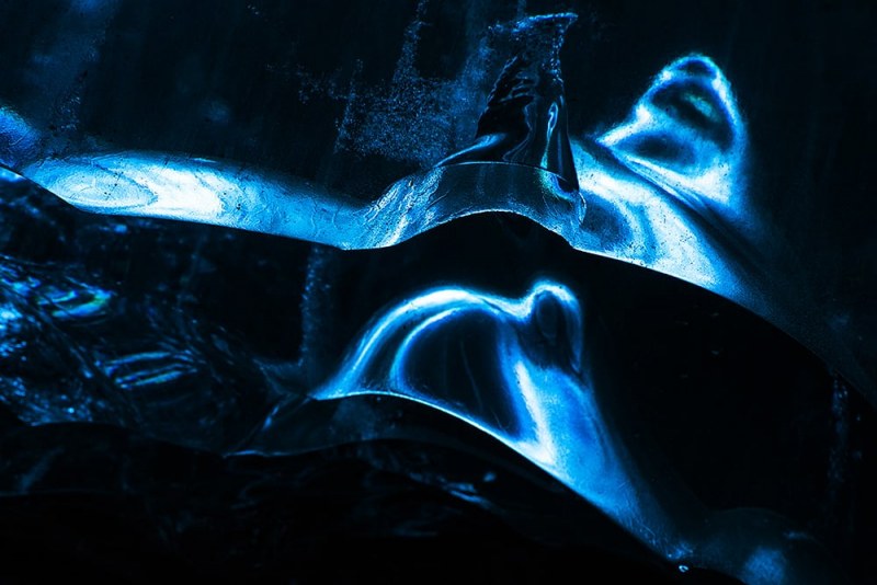
In this next shot, I am under the Vatnjökull glacier in an ice-cave. This was in a darker part of the cave where the light was coming through the ceiling in a strange way. The shot was originally spotted by Owen, our workshop assistant.
The strongest lines are at the edge of the ice with a very strong horizontal dividing the top third proportion. This line not only illustrates the edge of the ice, but also a sharp drop-off in light – this was a high dynamic range between highlights and shadows, this image required massive under-exposure (around 2 stops). The lower 2 thirds is divided by a diagonal curve on the more distant light. The lower 2 thirds contrast with the top third in terms of softness of focus and softness of lines.
I was composing with a 50mm prime so I had to move around to get the right proportions. When you compose with a prime, you don’t have the luxury of zooming in and out, so your position requires extra consideration of the proportion of the elements. Get the distance wrong and the proportions don’t work. Having a basic understanding of ratios and proportions helps us to make and break the rules of composition.
